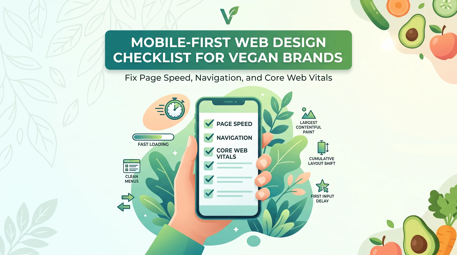
Mobile-First Web Design Checklist for Vegan Brands: Fix Page Speed, Navigation, and Core Web Vitals
Most vegan customers find your brand on their phone first. If that experience is slow, confusing, or broken, they leave. They rarely come back, even if they care deeply about what you sell.
Quick answer: Mobile-first web design means building your website for smartphones before building for desktops. For vegan businesses, this is not a nice-to-have. Your buyers discover you through Instagram, TikTok, Google, delivery apps, and local search, almost entirely on mobile. If your site is not fast, readable, and easy to act on from a phone, you are losing customers at the exact moment their intent is highest.
What Is Mobile-First Web Design for Vegan Brands?
Mobile-first web design is the practice of designing and optimizing your website for small screens first, then expanding the layout for tablets and desktops. This is the opposite of the old approach, which started with a desktop site and tried to shrink it for mobile. The result of that older method is familiar: tiny text, overlapping buttons, images that take forever to load, and menus that require frustrating precision tapping.
The key distinction worth understanding is this:
- Responsive web design adapts an existing layout to fit different screen sizes automatically.
- Mobile-first web design starts by building the most important, conversion-critical experience for the smallest screen, then enhances it for larger ones.
For vegan businesses, the gap between the two matters. A customer may discover your oat milk brand, cruelty-free skincare, or plant-based restaurant through a single post or search result. That first visit happens on a phone. The quality of that mobile experience determines whether the visit becomes a sale, a booking, or a bounce.
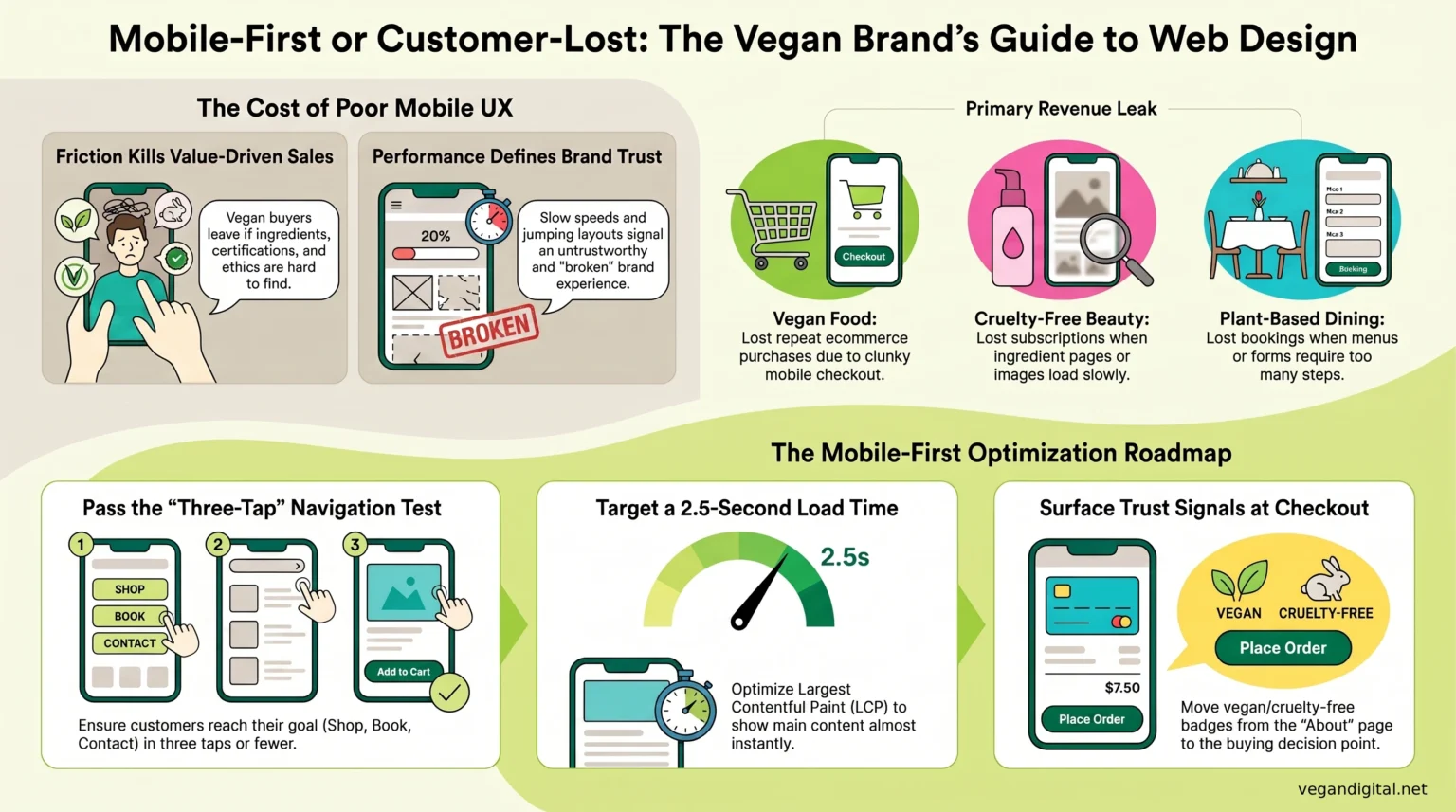
Why Poor Mobile UX Costs Vegan Businesses Real Customers
Weak mobile user experience silently drains revenue, and most founders do not spot it until they check the data. Here is what mobile friction costs, broken down by business type:
- Vegan food brands lose repeat ecommerce purchases when checkout is too slow or clunky to complete on mobile data.
- Cruelty-free cosmetics brands lose product discovery and subscription revenue when ingredient pages load slowly or images are too small to evaluate.
- Ethical fashion brands lose conversions when size guides, return policies, and shipping details are buried or hard to read on a phone.
- Plant-based restaurants lose bookings and delivery clicks when menus are not mobile-optimized or reservation forms demand too many steps.
The deeper issue is trust. Vegan consumers are making value-driven buying decisions. They want to check certifications, read ingredients, and confirm your ethics before purchasing. If that information is hard to find on mobile, doubt creeps in. Doubt kills conversions.
The Mobile-First Web Design Audit: Speed, Layout, and Core Web Vitals
Slow pages increase mobile abandonment, especially on product, menu, booking, and checkout pages where visitors are ready to act. Start your audit here:
- Compress all images to reduce file sizes without compromising visual quality.
- Remove unnecessary third-party scripts, tracking pixels, and plugins that add page weight.
- Avoid full-screen video backgrounds and oversized hero images on mobile.
- Run your key pages through Google PageSpeed Insights. Treat any score below 70 on mobile as urgent.
Core Web Vitals, explained plainly:
- Largest Contentful Paint (LCP): How quickly your main content, a product image, your menu, your headline, actually appears. Aim for under 2.5 seconds.
- Interaction to Next Paint (INP): How fast your page responds when someone taps a button or link. Slow INP makes the site feel broken.
- Cumulative Layout Shift (CLS): Whether content jumps around while loading. This causes users to tap the wrong thing and signals an untrustworthy experience.
These are not abstract scores. They are the exact experience your customers have on their phones.
What people miss: Core Web Vitals failures are rarely caused by one big problem. They are usually caused by several small ones compounding, such as an uncompressed image, a slow font load, and a heavy chat plugin all stacking together. Fix them in combination, not one at a time.
Fix the Mobile Journey: Navigation, Product Pages, and Checkout Flow
The best mobile navigation gets a customer from landing to action in three taps or fewer. If yours takes more, you are losing people who were already interested.
Navigation fixes to prioritize:
- Limit your menu to the six or seven highest-intent pages: Shop, Menu, Book, Ingredients, About, Contact.
- Do not hide key conversion pages inside dropdown sub-menus.
- Use plain, direct labels. “Explore” and “Discover” slow users down. “Shop” and “Book a Table” do not.
Ecommerce and checkout flow fixes:
- Add a sticky add-to-cart or reserve-now button that stays visible as users scroll.
- Show shipping cost, estimated delivery, and your vegan or cruelty-free certification near the buying decision, not buried in the footer.
- Reduce checkout to the minimum fields required. Every extra field is a conversion leak.
- Offer Apple Pay, Google Pay, or Klarna. Mobile users abandon carts when payment requires manually entering long card numbers.
What Most Mobile Design Guides Miss: Build for Vegan Buyer Trust, Not Just Screen Size
Most mobile-first design advice focuses entirely on layout and speed. It ignores the one factor that drives vegan customer decisions: verified trust.
Vegan consumers are not just checking whether your site loads fast. They are confirming whether your product is actually what it claims to be. On mobile, that requires specific attention:
- Vegan and cruelty-free certification logos must be visible on product pages and near checkout, not only on the About page.
- Ingredient lists need to be readable on small screens, not collapsed inside a tiny accordion that most users will not bother opening.
- Sustainability claims, allergen details, and sourcing information belong where buying decisions happen, not only in the footer or FAQ.
- Customer reviews from other vegan buyers carry extra weight with this audience. They scan for mentions of ethics, ingredient accuracy, and brand values, not just product quality.
A fast, well-designed mobile site that hides its values is still a leaky funnel for a vegan brand.
What Mobile-First Design Can Fix and What It Cannot
Mobile-first redesign will fix: slow page speed, poor Core Web Vitals scores, confusing navigation, broken checkout flow, low mobile conversion rates, and weak trust signals on product and menu pages.
It will not fix: poor product-market fit, weak brand positioning, low-quality product photography, an unclear value proposition, or insufficient traffic. Mobile optimization improves the conversion rate of existing visitors. It does not replace a marketing strategy.
Before investing in a mobile redesign, check your analytics. If you have strong mobile traffic but low conversions, mobile UX is almost certainly the problem. If your traffic is simply low, fix your SEO and content strategy first.
Mobile-First Web Design Checklist for Vegan Founders
Work through each step on a real phone, not a browser preview, before making any decisions about your site.
Step 1: Test on real devices.
Open your site on at least two different phones. Walk through the homepage, a product or menu page, the contact page, and your checkout or booking flow as if you are a first-time customer.
Step 2: Check page speed.
Run every key page through Google PageSpeed Insights. Any score below 70 on mobile is a priority fix, not a “nice to address eventually” note.
Step 3: Audit your Core Web Vitals.
Review LCP, INP, and CLS in Google Search Console under the Experience section. Any failing URLs need attention before anything cosmetic.
Step 4: Simplify navigation.
Count your menu items. If there are more than seven, cut. Test whether every important page is reachable in three taps or fewer.
Step 5: Make CTAs thumb-friendly.
Every button, whether Add to Cart, Book a Table, Get a Quote, or Subscribe, must be large enough to tap without zooming.
Step 6: Surface your trust signals.
Move vegan certifications, cruelty-free badges, key ingredients, and sustainability claims to your product pages and checkout screens.
Step 7: Tighten checkout or booking flow.
Remove unnecessary form fields. Add mobile payment options. Show shipping, delivery, or booking confirmation details before the final step.
Step 8: Review mobile SEO basics.
Check title tags, meta descriptions, and mobile usability errors in Google Search Console. Fix any pages flagged as not mobile-friendly.
Step 9: Measure mobile conversions in GA4.
Compare desktop versus mobile conversion rates. If mobile converts at less than half the desktop rate, that gap is your redesign brief.
If working through this checklist reveals multiple compounding problems, a piecemeal fix is unlikely to move the needle. That is usually when a strategic mobile-first redesign from a specialist vegan web design agency produces measurable results faster than patching issues one at a time.