Mobile-Friendly Websites: Why Most Vegan Customers Leave Without Them
Picture this. It’s 6:30 PM on a Tuesday. Sarah is hungry. She’s had a long day at work, and the last thing she wants to do is cook. She’s been vegan for three years and is craving a really good plant-based burger. She pulls out her phone, types “best vegan burger near me,” and your restaurant pops up. Her eyes light up. The photos on the Google Maps listing look incredible.
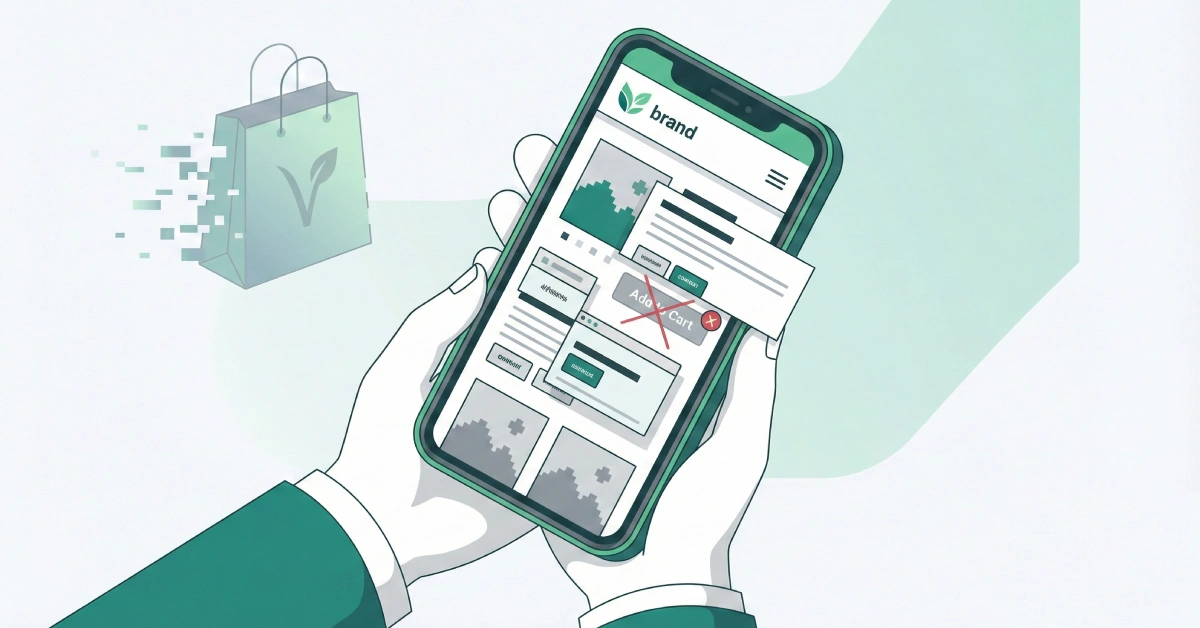
She clicks the “Website” button, ready to order.
But then, nothing happens. The screen stays white for five seconds. Finally, a giant logo loads, covering the whole screen. She tries to scroll down to find the menu, but the text is tiny—she has to pinch and zoom just to read the ingredients. A pop-up for your newsletter appears, but the “X” to close it is off the screen. She tries to click “Order Online,” but her thumb accidentally hits the “Contact Us” link instead because the buttons are too close together.
Frustrated, she sighs, closes the tab, and goes to the competitor down the street.
You just lost a sale. Not because your food isn’t amazing, but because your digital front door was stuck.
This scenario happens thousands of times every day. As a vegan business owner, you put so much heart into your product. You care about sourcing, ethics, and sustainability. But if your mobile website isn’t working for you, it’s actively working against you.
The Hard Truth: The Numbers Don’t Lie
You might think, “My website looks great on my laptop, so it’s fine.” But here is the reality check.
Most of your customers aren’t sitting at a desk. They are on the bus, walking down the street, or sitting on their couch. According to recent data from 2025, over 70% of all web traffic now comes from mobile devices. If you are in the food or retail industry, that number is even higher. Google reports that 89% of dining research is done by mobile before a customer ever steps foot in a restaurant.
If that doesn’t scare you, this will: 75.5% of mobile shopping carts are abandoned. That is three out of every four people who thought about buying from you but changed their minds. Why? Usually because the site was too slow, too hard to navigate, or just didn’t work right on their phone.
Think about that lost revenue. If you could save just a portion of those customers, what would that do for your bottom line?
Why Mobile Matters Specifically for Vegan Businesses
You are not just selling a product; you are selling trust.
When someone buys a regular t-shirt, they check the size. When someone buys a vegan product, they check the ingredients, the manufacturing process, and the company’s ethics. They need information, and they need it fast.
If a customer is standing in a grocery store aisle looking at your vegan cheese brand, they might pull out their phone to check your website. They want to know: Is this fair trade? Is it gluten-free? Who owns this company?
If your site is a mess on their phone, it sends a subconscious signal: “This company is disorganized.” In the vegan world, where transparency is key, a bad website can feel like you are hiding something. A clean, fast, mobile-friendly site says, “We are professional, transparent, and we value your time.”
The Core of Vegan Website Design
This brings us to the concept of vegan website design. It’s not just about using green colors and leaf icons. It’s about designing for the specific needs of a conscious consumer.
Good vegan website design on mobile means:
- Clear Ingredient Lists: Don’t hide them in a PDF that has to be downloaded. Make them text that is easy to read on a small screen.
- Trust Signals: Badges like “Certified Vegan,” “Cruelty-Free,” or “Non-GMO” should be visible immediately without scrolling.
- Easy Navigation: A “hamburger menu” (the three lines in the corner) that opens easily and has large, readable links.
Here is the thing about design: it has to get out of the way. Your customer wants the burger, the shoes, or the soap. The design should act like a helpful shop assistant, handing them what they need, not a barrier they have to climb over.
Speed Kills (or Saves) Your Business
Let’s talk about speed. We live in a world of instant gratification.
Google found that 53% of mobile users will leave a site if it takes longer than three seconds to load. Three seconds. Count that out loud. One… two… three. That’s it. If your delicious photos of cashew cheese take five seconds to load, half your potential customers are gone before they even see them.
A study in 2025 showed that a one-second delay in mobile load times can impact conversion rates by up to 20%. That is a direct hit to your pocketbook.
Often, vegan businesses make the mistake of uploading super high-quality, raw images of their products. While they look beautiful, these huge files clog up the digital pipes. A 4MB photo of a salad might look crisp, but on a 4G connection, it’s a brick wall for your customer.
How AI Can Help You Fix This (Without Hiring a Tech Team)
This is where it gets exciting. You don’t need to be a coder or spend thousands of dollars on a developer to fix these problems anymore. Artificial Intelligence (AI) has made high-end tech accessible to small business owners like us.
Here is how you can use AI to solve your mobile woes:
1. Image Optimization on Autopilot
You know those huge photos slowing down your site? AI tools can fix that. Platforms like simple plugins on WordPress or tools like TinyPNG use smart algorithms to shrink the file size of your images without losing quality. They remove the data the human eye can’t see, making the image load instantly.
2. AI-Powered Chatbots for Instant Answers
Remember Sarah, who couldn’t find the menu? Imagine if, when she landed on your site, a small, friendly chat bubble popped up saying, “Hey! Looking for our menu or want to book a table?”
These aren’t the robotic, annoying bots of the past. Modern AI chatbots (like those built on ChatGPT technology) can understand natural language. If a customer asks, “Do you have soy-free options?” the bot can scan your menu and answer instantly, “Yes! Our Lentil Burger and Quinoa Salad are both 100% soy-free.”
This keeps the customer on your page and answers their questions before they have a chance to leave.
3. Writing Code for You
If you are a bit more hands-on and building your site on a platform like Squarespace, Wix, or Shopify, AI can help you customize it. You can literally ask an AI tool, “Write me a piece of HTML code for a ‘Order Now’ button that sticks to the bottom of the mobile screen so it’s always visible.”
It will write the code for you. You just copy and paste.
The “Thumb Zone” Rule
Here is a practical tip you can check right now. Pick up your phone. Hold it the way you usually do, with one hand. Now, look at where your thumb naturally rests.
This is called the “Thumb Zone.”
Most people scroll and click with their thumb. The center of the screen and the bottom corners are easy to reach. The top corners? That’s “No Man’s Land.”
If your “Add to Cart” button or your “Menu” link is in the top left corner, you are forcing your customer to adjust their grip or use two hands. It sounds like a small thing, but it causes friction.
Test it yourself:
- Open your website on your phone.
- Try to navigate through it using only your thumb.
- Can you reach the most important buttons comfortably?
- If not, you need to move them.
Google’s Mobile-First Indexing: The SEO Giant
We can’t ignore Google. A few years ago, Google switched to “Mobile-First Indexing.”
In simple English, this means Google looks at the mobile version of your website first to decide where to rank you in search results. It doesn’t matter if your desktop site is a masterpiece. If your mobile site is slow or broken, Google will push you down the list.
For a vegan business relying on local SEO (people searching “vegan food near me”), this is critical. You could have the best vegan cookies in town, but if Google thinks your mobile site is poor, it will send those customers to the bakery next door.
Accessibility is an Ethical Issue
As vegans, we care about reducing harm and being inclusive. That ethic should extend to your website, too.
A mobile-friendly site is often an accessible site. This means it works well for people with visual impairments who use screen readers, or people with motor difficulties who can’t tap tiny buttons.
By using clear fonts, high contrast (dark text on light background), and proper “ALT text” for your images (descriptions of the images for the blind), you are making your business welcoming to everyone. It’s not just good business; it’s the right thing to do.
Actionable Steps for You Today
You might be feeling a bit overwhelmed. That’s okay. You don’t have to fix everything overnight. Start here:
- Run the Test: Google has a free tool called “PageSpeed Insights.” Go there, type in your website URL, and hit analyze. It will give you a score and tell you exactly what is slowing you down.
- Check Your Media: Look at the last 5 photos you uploaded. Are they over 1MB? If so, replace them with smaller versions.
- Be a Customer: Ask a friend who has never used your site to try and buy something on their phone while you watch. Don’t say anything. Just watch where they get stuck. That is your to-do list.
- Use Simple Tools: If your current website platform is too hard to manage, consider switching. Modern builders like Shopify or Wix have “mobile responsiveness” built-in automatically.
The Bottom Line
Technology moves fast. It can feel cold and robotic, the opposite of the warm, compassionate values that drive the vegan movement. But we have to look at it differently.
Technology, when used right, is a bridge. It’s the bridge between your passion and the person who needs it. It’s how you get your cruelty-free message, your sustainable products, and your delicious food into the hands of the people who are looking for them.
A mobile-friendly website isn’t just a technical requirement. It’s an act of service to your customers. It shows them that you respect their time and their experience.
So, here is the question you need to ask yourself today: If your dream customer tried to visit your business on their phone right now, would you be opening the door for them, or locking them out?