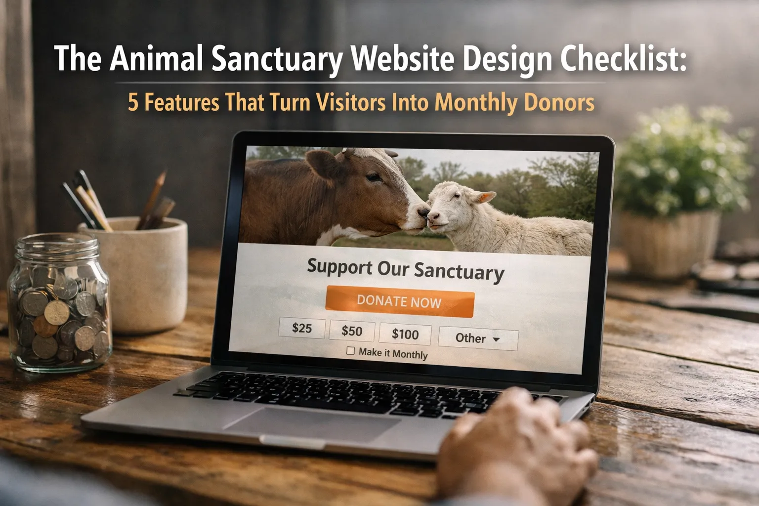
The Animal Sanctuary Website Design Checklist: 5 Features That Turn Visitors Into Monthly Donors
Animal sanctuary website design should make monthly giving feel clear, safe, and emotionally real within seconds.
Quick answer: The best sanctuary websites do five things well. They guide visitors into a donation flow built for monthly gifts, use specific animal stories, prove trust, work smoothly on mobile, and give every supporter a clear next step.
What Is Animal Sanctuary Website Design?
Animal sanctuary website design is the structure of a sanctuary site so people can quickly trust the organization, understand the impact, and take action.
- It is not just visual design. It includes donation flow, page speed, mobile usability, navigation, and impact messaging.
- It is different from a generic nonprofit site. Sanctuaries depend on emotional connection, recurring care costs, and actions like sponsorships, visits, volunteering, and adoption interest.
- A strong animal sanctuary donation page answers three questions fast. Who are you helping, why should I trust you, and what does my donation do?
- Good donor-friendly website design removes friction. It makes online donations for animal charities easy to complete on a phone.
Why Most Animal Sanctuary Websites Lose Monthly Donors Before the Donation Page
Most sanctuary websites lose monthly donors because the path from interest to action is unclear, slow, or hard to trust.
- The main donation call to action is often weak or hidden. Some sites bury it in the menu or show it only once on the homepage.
- Many donation pages are too generic. They have no monthly option, no impact copy, and too many fields.
- Mobile friction kills intent fast. Small buttons, slow load times, and clunky forms matter more than many teams think.
- Recurring donors need more confidence than one-time donors. They are starting an ongoing relationship, not making a one-off gift.
What people miss: The problem is often not traffic. The real issue is conversion. A better donation page can outperform months of extra posting if more existing visitors become monthly donors.
If you want to check speed and mobile performance, use Google PageSpeed Insights. It gives a practical starting point for fixing technical friction.
Feature 1, A Donation Funnel Built Around Monthly Giving
A donation funnel built around monthly giving increases recurring donations by making the monthly option visible, easy, and tied to real care outcomes.
- Put monthly giving first. Make it the default option on the animal sanctuary donation page, while still allowing one-time gifts.
- Use suggested amounts with clear impact. For example, $25 per month helps cover hay and bedding for one rescued goat.
- Keep the form short. Name, email, amount, and payment details are usually enough.
- Place trust cues near the button. Add secure payment language and a short privacy note.
A strong animal sanctuary donation page is specific. “Support our mission” is weaker than “Become a monthly donor and help fund daily feed, bedding, and vet care.”
For best practices on online donation usability, see this Nielsen Norman Group study.
Feature 2, Storytelling That Makes Donors Feel the Impact
Storytelling increases donations when it turns a broad mission into one life, one cost, and one visible outcome.
- Create short animal stories. Include a name, rescue context, current needs, and a simple progress update.
- Use photos carefully. Build connection without relying on shock value.
- Link stories to recurring support. Show that rescue costs continue long after intake day.
- Offer sponsorships where it fits. This works especially well for animals with strong supporter appeal.
Many animal rescue website design tips fail because stories live on social media, but the website does not connect them to a donation path. The homepage, animal profile pages, and blog should all point toward monthly giving or sponsorship.
A simple line often works best. “$15 per month helps provide fresh produce for rescued pigs like Willow” is stronger than broad mission language.
Feature 3, Trust Signals That Prove Donations Are Used Well
Trust signals convert sanctuary supporters into monthly donors because they reduce uncertainty about where the money goes.
- Show simple proof. Use annual reports, rescue numbers, care costs, testimonials, and recent updates.
- Place trust elements on key pages. Do not hide them in the footer.
- Use plain language. Donors do not need a perfect reporting system, but they do need honest signals.
- Strengthen the post-donation experience. Thank-you pages and confirmation emails help reduce doubt.
What this can fix, and what it cannot fix: Better trust design can fix vague copy, weak proof, and poor page structure. It cannot fix deeper operational issues such as inconsistent donor communication or unclear finances.
If your team is stretched, start small. Add one impact section, one recent rescue update, and one clear explanation of where monthly gifts go.
Feature 4, Mobile, Local SEO, and Technical Foundations That Help Supporters Find and Use the Site
Animal shelters use SEO to get more online donations by making key pages easy to find in search and easy to use on mobile.
- Optimize for real search terms. Use location-based sanctuary terms, donation intent terms, and animal-specific care topics.
- Keep mobile pages fast and readable. Use large buttons, short forms, and simple layouts.
- Help search engines understand the site. Make donation, visit, volunteer, sponsor, and animal story pages easy to crawl.
- Use local trust signals. Keep your Google Business Profile updated and your address details consistent.
This matters because many supporters arrive from Instagram, email, or local search on their phones. If the mobile donation flow fails, the moment is lost.
Useful tools include Google Search Console for query data, Google Business Profile help for local visibility, and schema.org Organization for structured data guidance.
Feature 5, A Clear Action Path for Every Type of Supporter
A clear action path increases conversions because not every visitor is ready to donate right away, but every visitor should know the best next step.
- New visitors may need trust first. Send them to animal stories, the mission, or recent updates.
- Warm supporters may need a lighter action. Offer email signup, sponsorships, or a rescue update page.
- High-intent visitors should reach donation fast. Do not make them dig through the menu.
- Long-term supporters need deeper options. Volunteering, visits, adoption interest, and project funding all matter.
What competitors often miss: Sanctuary websites need more than donation buttons. They need clear paths for sponsorships, volunteering, visits, and long-term supporter retention.
Animal Sanctuary Website Design Checklist, 5 Steps to Improve Recurring Donations
The best way to improve animal sanctuary website design is to fix one conversion layer at a time.
- Audit the donation flow. Check whether monthly giving is obvious, the form is short, and the page works on mobile.
- Rewrite for impact. Replace generic appeals with concrete outcomes tied to real care costs.
- Add trust signals. Publish recent updates, simple impact numbers, and transparency cues.
- Build supporter paths. Link animal stories, sponsor pages, volunteer pages, and visit pages to the right next action.
- Fix technical basics. Use Search Console, PageSpeed Insights, and local SEO improvements to help supporters find and use the site.
If your sanctuary website gets traffic but struggles to turn visitors into monthly donors, the issue is often structure, not mission strength. That is where a specialist vegan web design agency can help.